Event design Agency
Client
Mimosa Space
Year
2023

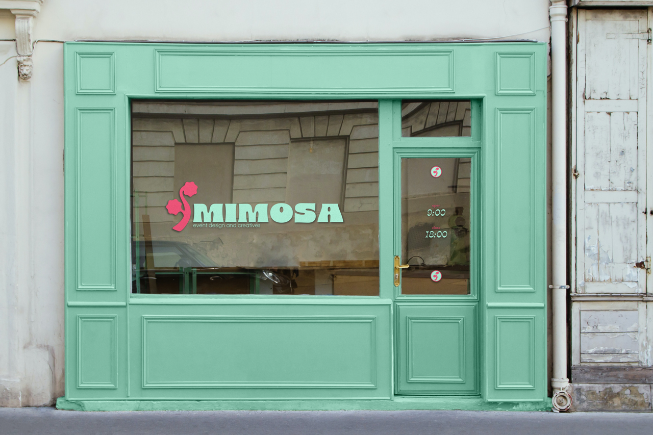
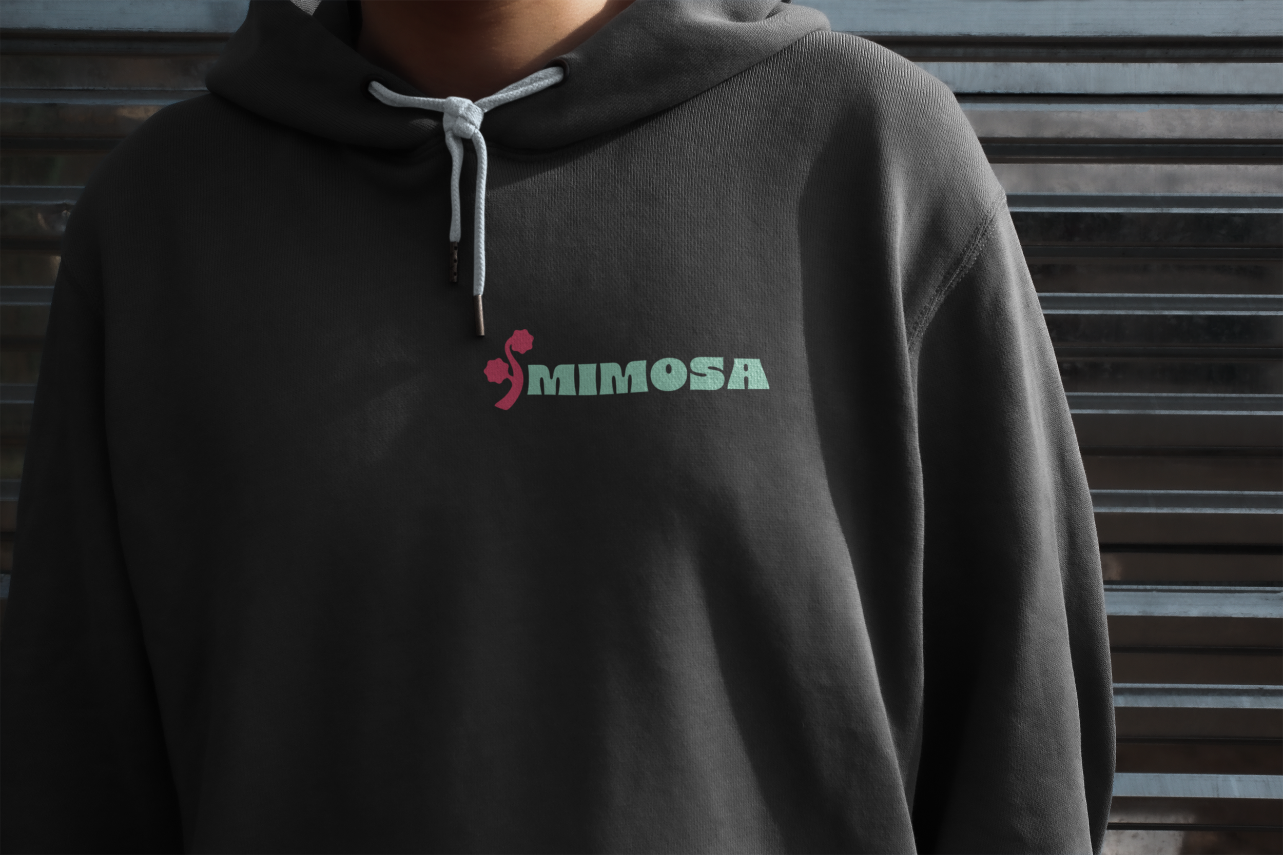
Brand Design for Mimosa Creative Decor Agency
Mimosa is an agency specializing in event design, photo location styling, and floral design. The goal was to create a cheerful and bold identity that reflects the agency’s creative vision and highlights the founder’s favourite flower, the mimosa.
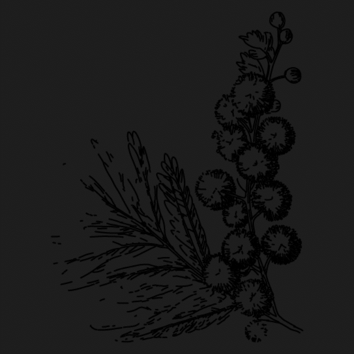
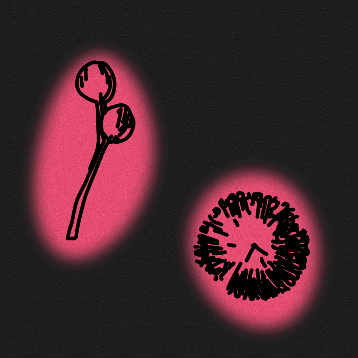
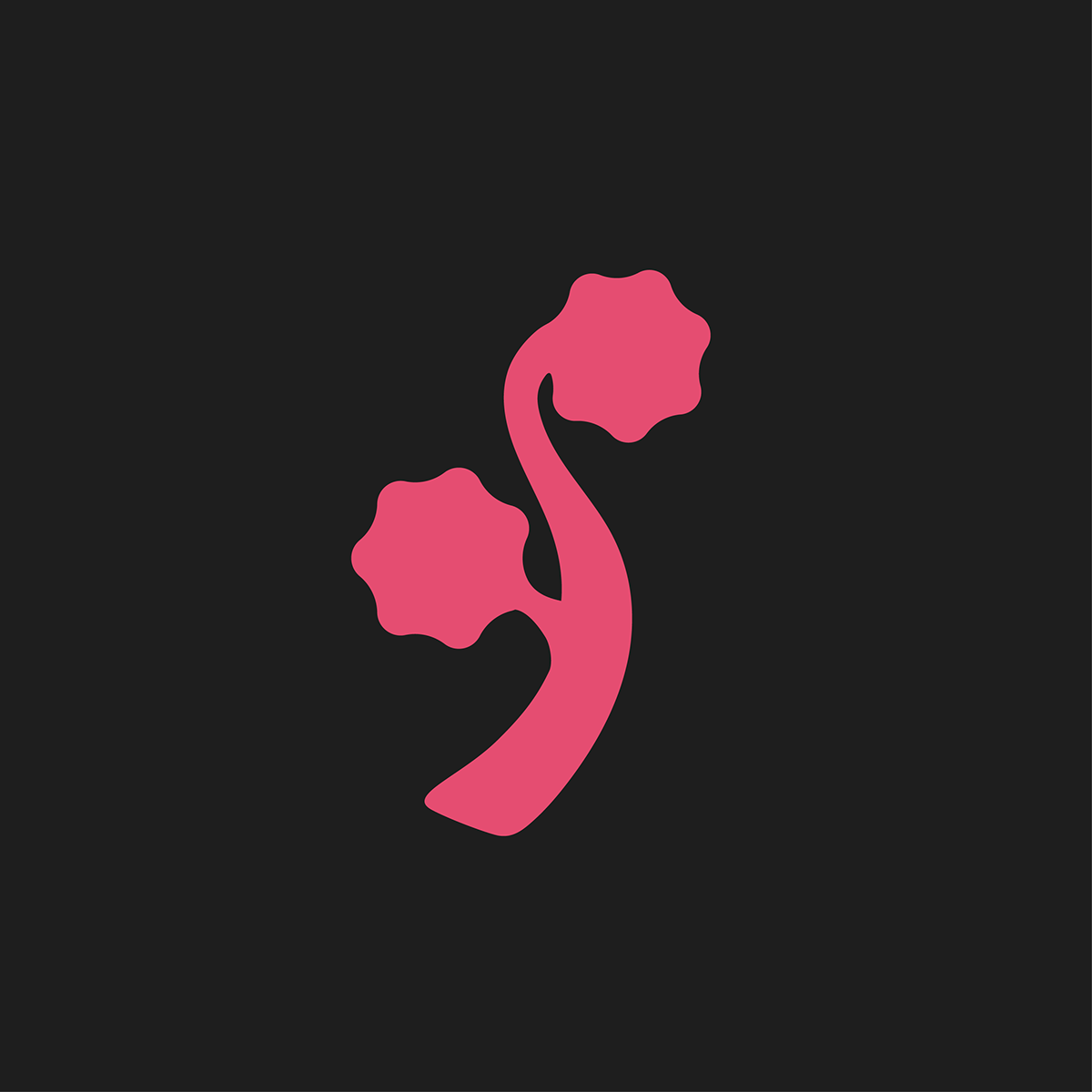
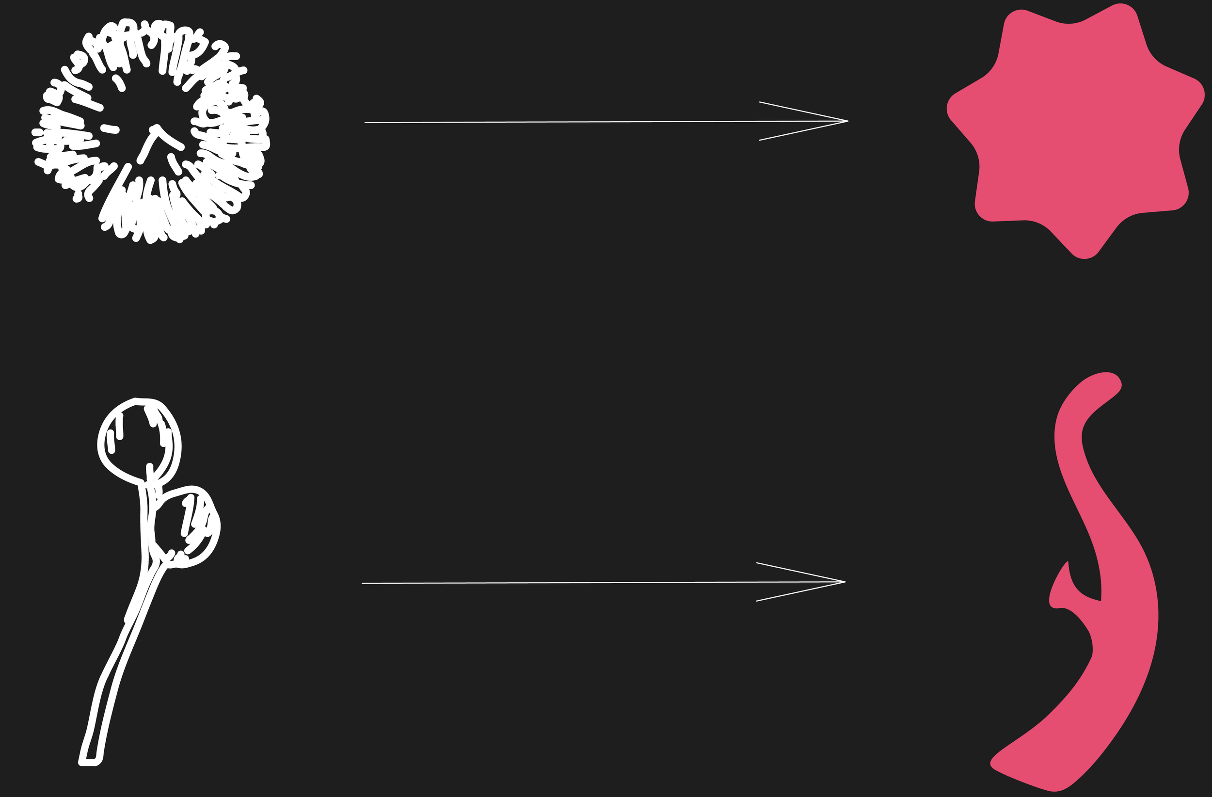
I started with the main symbol — the mimosa. It represents cheer, with a playful nod to the cocktail loved by the target audience, and family values, tying into the brand’s story.
Looking closely at a mimosa branch, I noticed two shapes that stood out and combined them in a unique way.

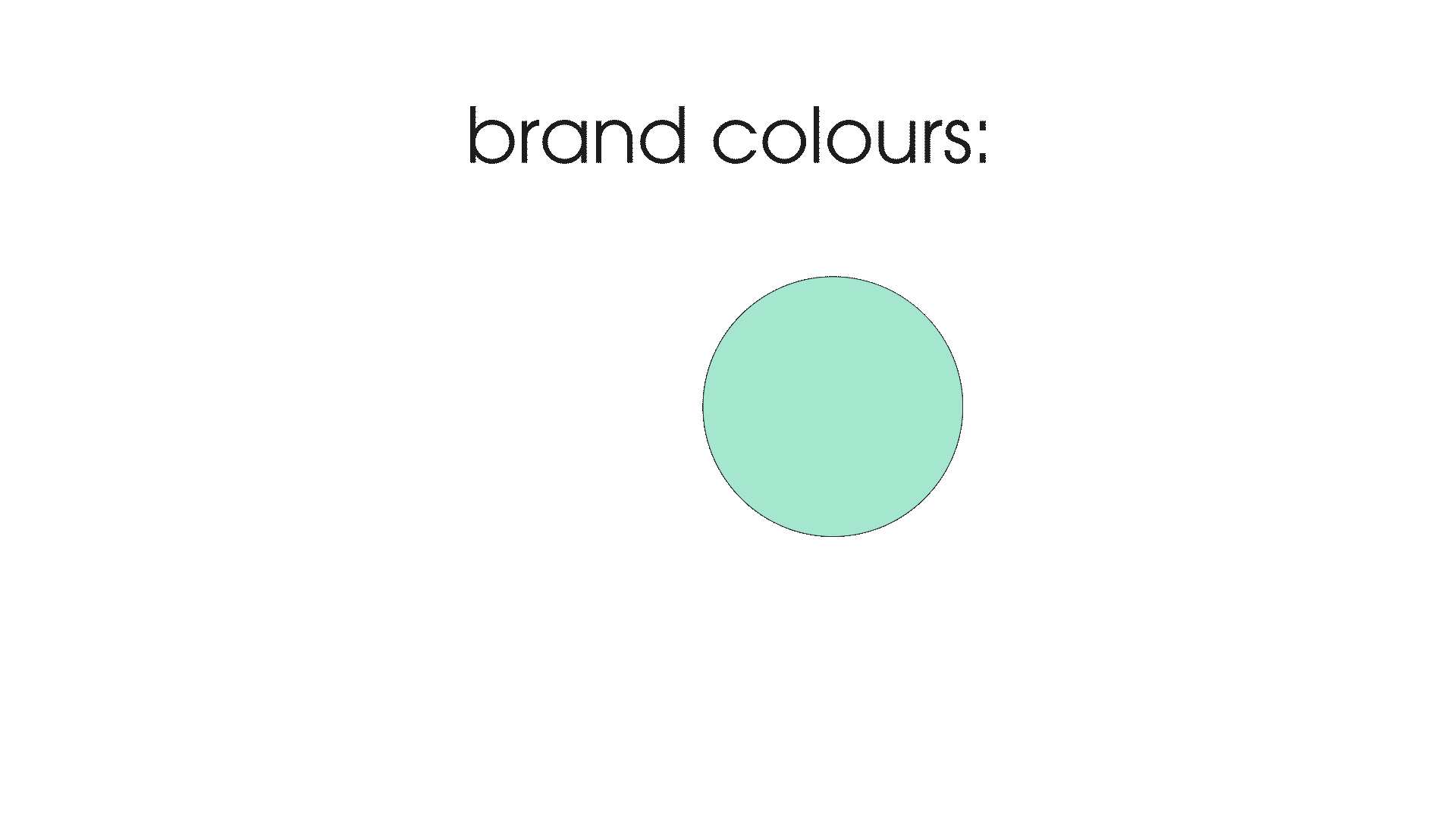
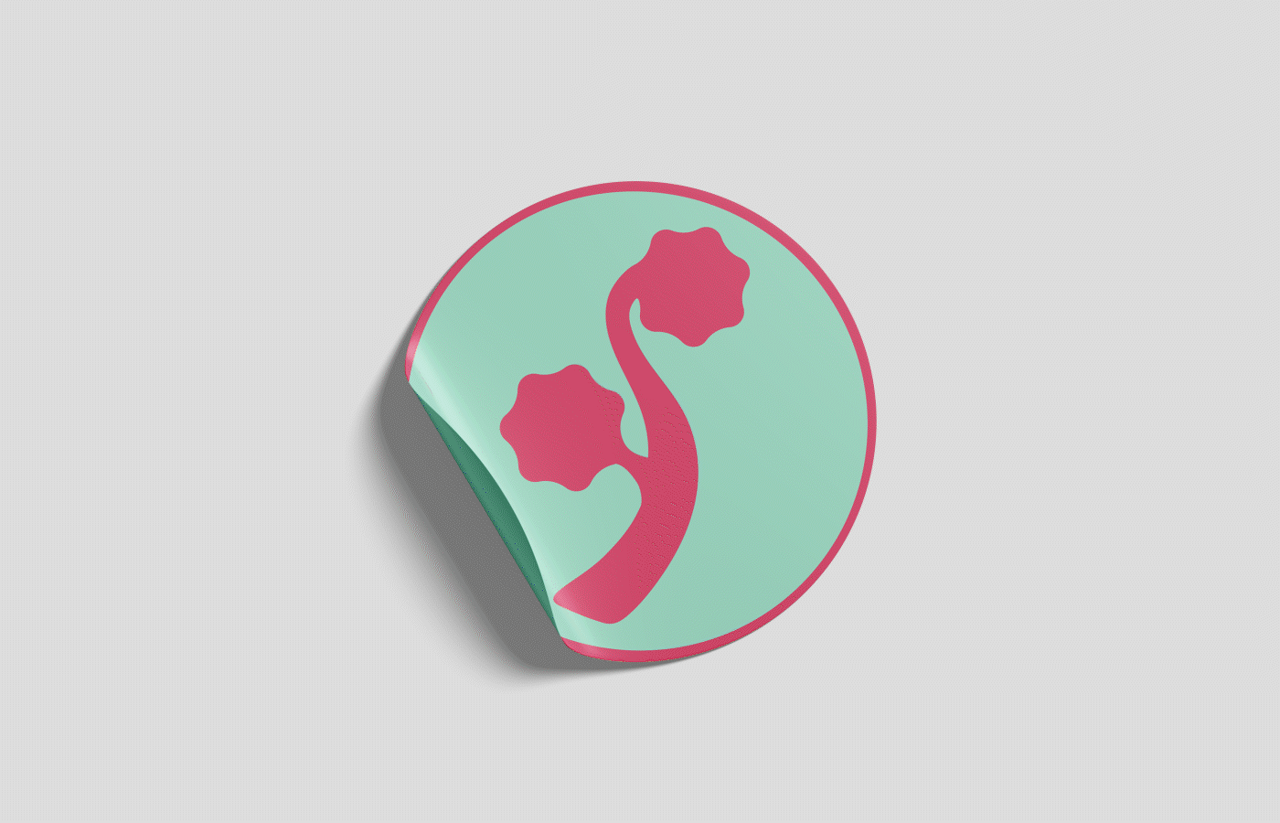
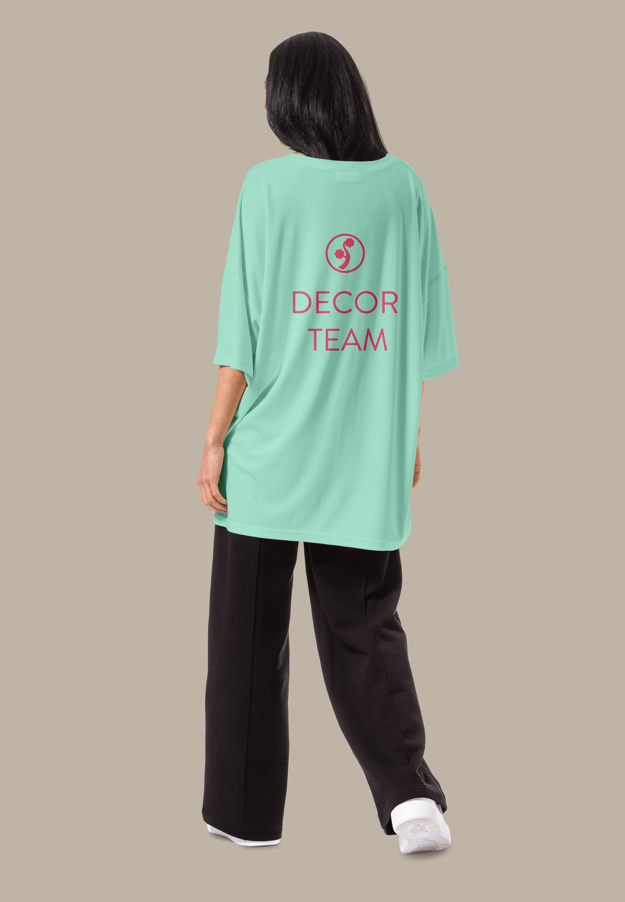
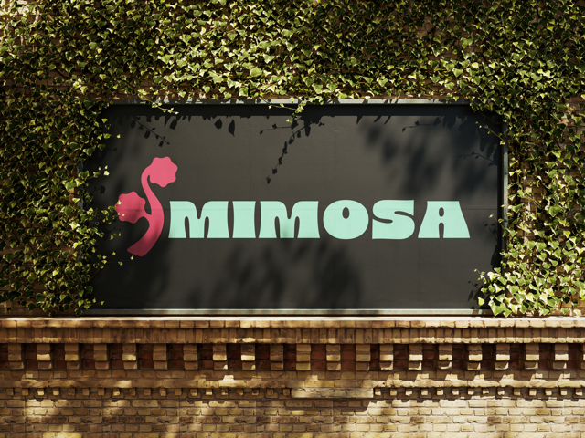
After deciding on the shapes, I worked on building a colour palette to suit the brand.
We finalized four colours: two primary accents featured in the logo and two secondary colours for marketing materials, the website, and more.

and that's how I created Mimosa's logomark.